I’ve just come across an old Agile Chronicles post about burndown patterns, which makes the following observation:
Flat-line (i.e., zero net progress) – a flat-lined burndown chart may have a number of explanations:
- The team may have been pulled to work on other projects or priorities (i.e., another project, support and maintenance) and has left the current project helpless to succeed.
- The team may be completing work at an expected rate, but new features and/or tasks are being added to the iteration or project as fast as work is being done.
- Defects and rework may be preventing real progress from being made.
We looked a while ago on our project at how to make at least the second of those possibilities explicit on the graph, and came up with a simple solution, which I thought I’d share here. I’m sure it’s not original, but it doesn’t appear to be all that common either, so someone might find it useful.
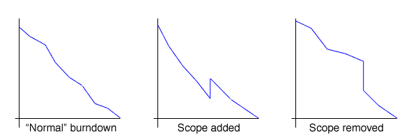
Basically, if a new user story is added to the scope, or one is removed, this is shown as a vertical discontinuity on the graph at the point where the scope changes. In other words, if you’ve already plotted yesterday’s numbers, you add or remove the new estimate and plot another point for yesterday, rather than just including the scope change with today’s point on the graph.
4 replies on “Highlighting scope change in burndown graphs”
Hello there! Would you mind if I share your blog with my zynga group?
There’s a lot of people that I think would really enjoy your content.
Please let me know. Many thanks
my blog: Travelling News
Yes! Finally something about computer.
Feel free to surf to my blog post – Special Quest Online
It’s a shame you don’t have a donate button! I’d definitely donate to this outstanding blog!
I guess for now i’ll settle for bookmarking and adding your RSS feed to my Google account.
I look forward to brand new updates and will share this site with
my Facebook group. Chat soon!
Nice post. I was checking constantly this blog and
I’m impressed! Very helpful info specially the final part :) I deal with such
info much. I used to be seeking this particular info for a very long time.
Thank you and best of luck.
My web site; Wsaia